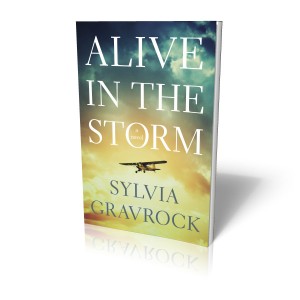
This week, we got the chance to hang out with a designer we know and love, Ryan Scheife from Mayfly Design!
Ryan, you’ve worked with authors to design their books for over five years now, what’s the number one mistake newbie authors make about design?
- I would advise you to let your designer utilize their skills and experience, and let them show you some cover concepts that represent their visions for your book. Coming into the process with your vision for the book’s cover is great, and can only help get things off on the right track. But I would let the designer work through a couple of their concepts as well. More often than not, you will see some ideas that will thrill you, and that you never thought of. Having multiple successful covers to choose from for your book is a great problem to have!
Cover design is so important to sell a book, especially now that so many readers are viewing them electronically. How do you feel about indie authors using crowdsourcing sites like 99designs and CrowdSpring?
- This is an interesting concept, and I think it has its place for some cost-conscious authors. However, the old adage “you get what you pay for” definitely comes into play here. In my opinion, it seems a shame to pour so much time, effort, and emotion into writing your book, only to put the design and production of it into the hands of the lowest bidder. I have to admit, when I was first getting my business off the ground, I bid on projects on similar websites, just to get some experience under my belt, so these sites serve a purpose for both parties. In short, if your budget is very tight, it might be worth checking out. You might get lucky and get paired up with a talented new designer who is ambitious and motivated to create the best design—both for you and for their portfolio—no matter what the budget. However, your dollar might go farther by hiring a seasoned designer with the experience and portfolio to back up their higher fees. Talent, knowledge, and confidence come at a higher cost—a cost which I think it well worth the investment.
Now that so many authors are choosing to release their books as e-books, has that affected your approach to design?
- Starting out as a book design ten years ago, I was always told not to put the title of the book at the bottom of the book cover to prevent it from getting covered up when sitting behind other books on the bookshelf in the store. However, things have changed over the years, and design considerations have evolved due to the influx of online bookstores like Amazon and iTunes. I now take more care to make sure the book cover is legible and still visually appealing at a smaller, thumbnail size on screen for when it appears as a listing on Amazon. Other than that, the approach and overall goal of an engaging, attractive cover that is appropriate for the content and audience is pretty much the same.
- The layout of the book’s pages is what has evolved the most over the past few years with the popularity of the eReader devices on the market today. Generally speaking, I like to err on the side of simplicity with my eBook designs, knowing that some eReaders struggle with complicated design elements. Fiction books that are primarily straight text are quite simple, and can in fact be easier to “design” than a conventional print book. Some non-fiction books that include various lists, charts, tables, and so forth, can be trickier and require more time, but again, simplicity is the key here.
Our experience working with you on The Indie Author Revolution was eye-opening. We were surprised at the level of ownership you took in the book. You made great suggestions throughout. What should indie authors expect when they work with you?
- I understand that indie authors are flying somewhat blind through their publishing process, and that they are looking for insight and advice every step of the way. Having worked in the publishing industry for over ten years, I can provide guidance beyond just the design and production process—whether you need to be connected to other vendors like printers, editors, or indexers, are unsure how to obtain your ISBN number, or want to plan ahead for your marketing strategies by designing and printing business cards and other marketing materials. In addition, as a part of my page design and typesetting workflow, I keep an eye out for subtle editorial inconsistencies in your manuscript, and will make suggestions along with my other notes on things like em dashes versus en dashes, how to properly display ellipses, superscripts, underlining, and so on, just to make sure the smaller details are taken care of.
You see hundreds of books per year. What were the traits of the books that most inspired you?
- When I started in book design, I tended to create designs that had a bit too much going on—a lot of colors, textures, multiple images, and so on—I thought the more the better. I have learned that sometimes the most successful design is the most simplistic in approach. If we are talking about book cover design, start with the most engaging image for the focal point, and fill in from there. The reader should pick up the cover and really get drawn in to that one thing on the cover, and not have to jump around to competing elements on the cover. Perhaps it is a clever idea or image that clicks the lightbulb on in your head after a second; that is all that you need, and don’t need to nail that message home any more than that. I have a folder of bookmarked websites that feature successful books designs, which I visit when I need a bit of inspiration. A couple of my favorites are bookcoverarchive.com and nytimesbooks.blogspot.com.
- As for the design of your book’s interior pages, simplicity and being unintrusive is the key. The design should almost go unnoticed, especially for fiction books. There is a bit more room for creativity for nonfiction books, coffee table books, memoirs, and so on, as long as it is appropriate to the content. Even still, not always an appropriate time for a designer to go overboard.
What’s your advice to indie authors as they interview and research their book design options?
- Be sure you have a good good impression as you are interviewing potential designers for your book. Their portfolio may impress the pants off of you, but is there chemistry and potential for a working relationship with this person? Are they responsive to your emails and phone calls? Are they receptive and willing to accommodate your feedback? Are they asking the right questions and providing the insight you’d expect from an experienced vendor? It’s hard to see these traits on a resume or on their web site, so be sure to tune in to these things as you begin initial discussions to ensure your design process is not only successful, but also enjoyable, too!
Ryan Scheife
Mayfly Design
ryan@mayflydesign.com
612-804-9689


