It takes great writing and an eye-catching cover to blend in with high-budget, traditionally published books, to be sure. But when the editing’s been done and the layout’s coming together, there’s one feature it’s imperative an indie author gets right to make your book look as polished as possible: front matter.
Front matter is the stuff in your book that comes before the actual content. Think title page, copyright page, table of contents, dedication, endorsements, etc.
The organization of your front matter might not seem like a big deal, (after all, most people skip or skim over it), but it affects the experience of reading that first page, how easy it is for your reader to find a section they’re looking for, and even your experience of autographing copies.
So what’s the right way to assemble all that pesky info that shows up before the good stuff?
First, you’re going to need to make a list of the front matter you actually have.
Required pieces include:
- Copyright page
- Title page
Optional pieces include:
- Endorsements
- Second title page
- Dedication
- Foreword
- Prologue
- Author’s note
- Table of contents
- Other works by the author
- Introduction
- Instructions on how to use this book
- Epigraph
- List of illustrations, characters, etc.
- Maps
It’s imperative that you don’t include extra front matter if you don’t need it. We’ve seen books with an author’s note and then a preface and then an introduction, and that’s just too much.
What pieces of front matter will enhance your audience’s reading experience?
You don’t want too much front matter, because your reader will get annoyed, but you also don’t want to start your main content on the first page because that’s not a pleasant book to hold.
Every book is different, and every genre has different front matter requirements, but here are some basic rules about how to curate your front matter:
- Endorsements always come first, right next to the inside cover, so browsers can see how amazing your book is right away!
- The copyright page is always on the left, and is usually the first or second page with text on it.
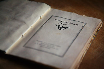
- The title page comes is always on the right, and usually comes after the copyright page. It can also have a blank-facing page to give it more oomph (especially if it’s a black-and-white version of the cover). This is often where you sign.
- A second title page is simple. Where the first title page is often a reproduction of the cover, when two title pages are used, the second one is just the title, centered 1/3 of the way down the page. You can also sign here.
- Aids for your text come at the end, near the beginning of the main content. You want things like maps and genealogies to be close to its related content. Note: some authors print a map on the inside of their front cover, especially if it’s a hardback. This is an exception to the rule.
- Other works by the author should list works, plural. If you only have one other book, don’t waste an entire page saying so. Just put it in your bio, or in the back as part of your “contact the author” page.
- Tables of contents only work if you have chapter and section titles. Because who cares that chapter 11 begins on page 120? Also, try to avoid TOCs if you have a LOT of short chapters. Try and stick to 1-2 pages.
- Blank pages are your friends. Print out your front matter and arrange it in the way you’d see it in your book. If something looks wonky or crowded, don’t be afraid to insert blank pages here and there to keep pages where you want them.
Ultimately, these are actually more guidelines than rules (except for the title page and copyright page guidelines—those are iron fast), and only when you play around will you know what’s best for your book. Also take a look on your shelves, and see what you do and don’t like.

